HidrateSpark;
Building a brand system for the smartest way to stay hydrated
Overview
A brand built for the intersection of smart tech and personal wellness.
HidrateSpark sits in a crowded space, water bottles, wearables, health apps, and had to earn its place in all three at once. I was brought on to establish the brand’s color palette and typeface, then carry that system through marketing creative and a full packaging suite spanning retail, direct-to-consumer, and sports partnerships. This case study walks through how one consistent system flexed across each of those touchpoints, from an Apple store shelf to a stadium concourse.Brand Foundation
Clinical precision, with an energetic pulse.
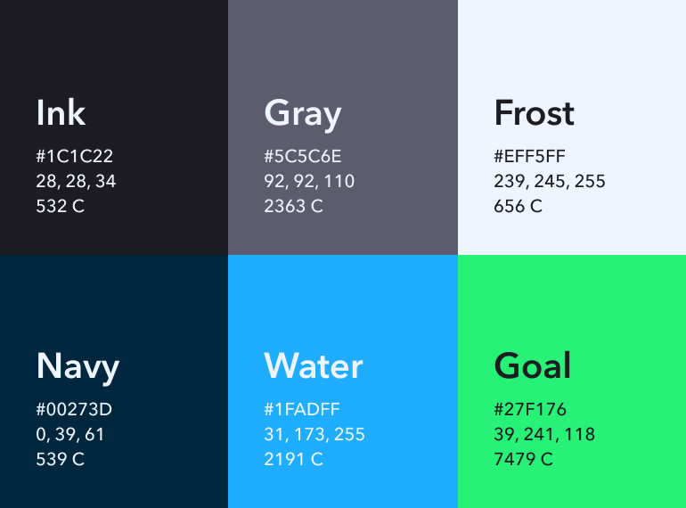
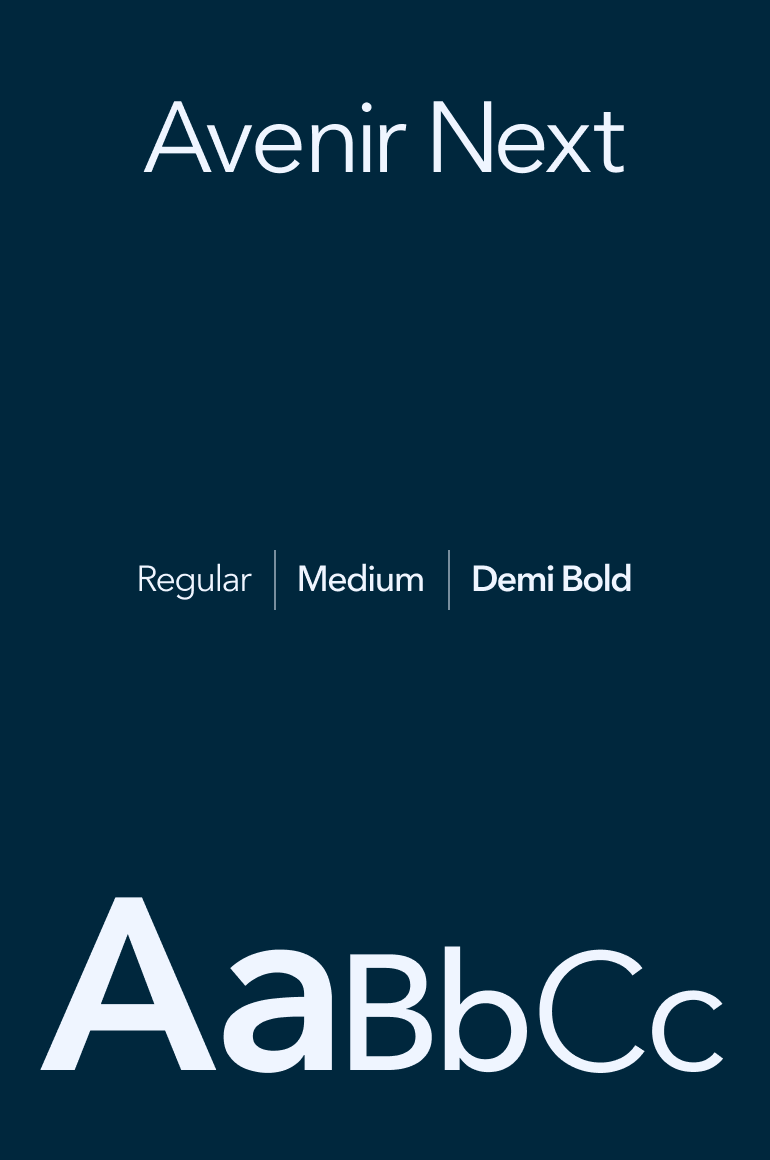
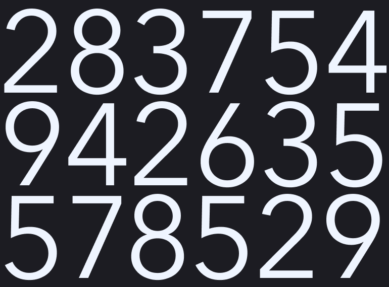
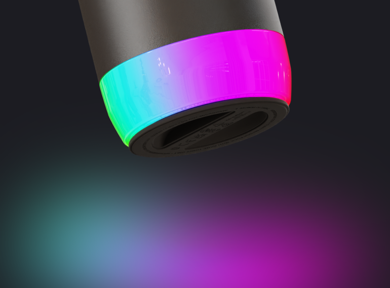
I built the palette around deep Ink and Navy, grounded, credible colors that nod to the product’s health-tech roots, paired with an electric Water blue and a vivid Goal green that mirror the bottle’s own signature LED glow. Avenir Next carries the system end to end: geometric, clean, and legible at app-icon scale or billboard scale, reinforcing a brand that takes hydration seriously without ever feeling clinical or cold.
Marketing Creative
Making a daily habit feel like a breakthrough.
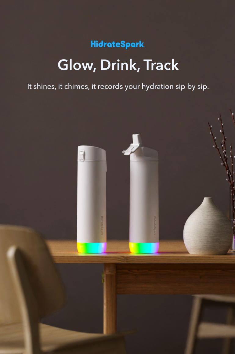
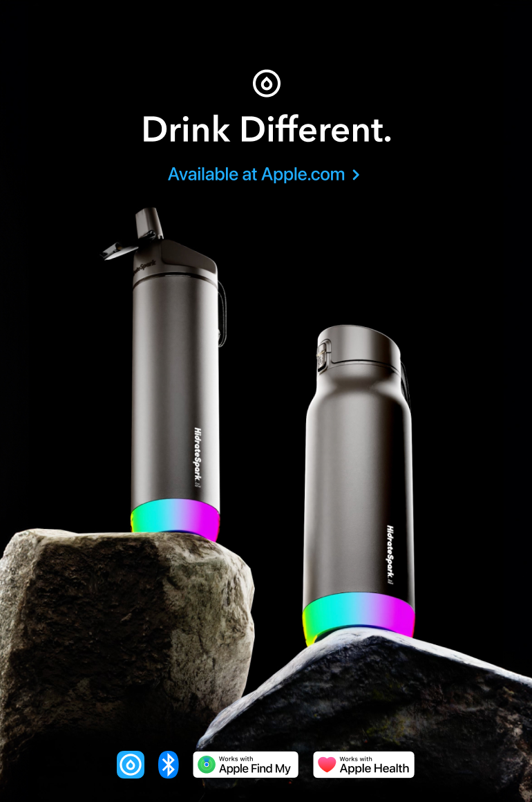
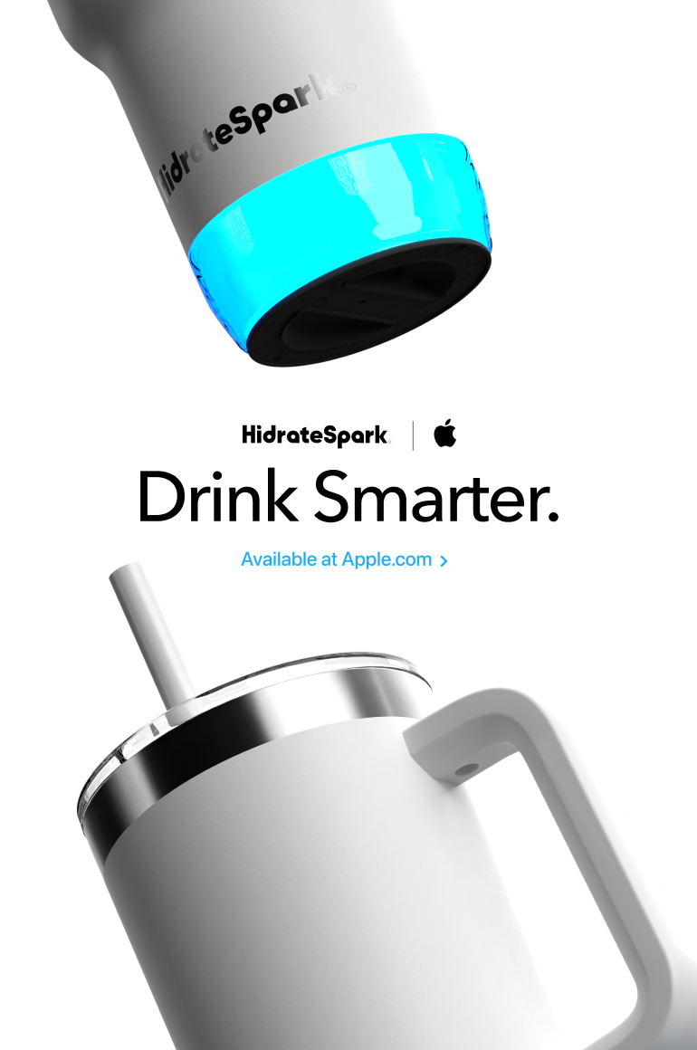
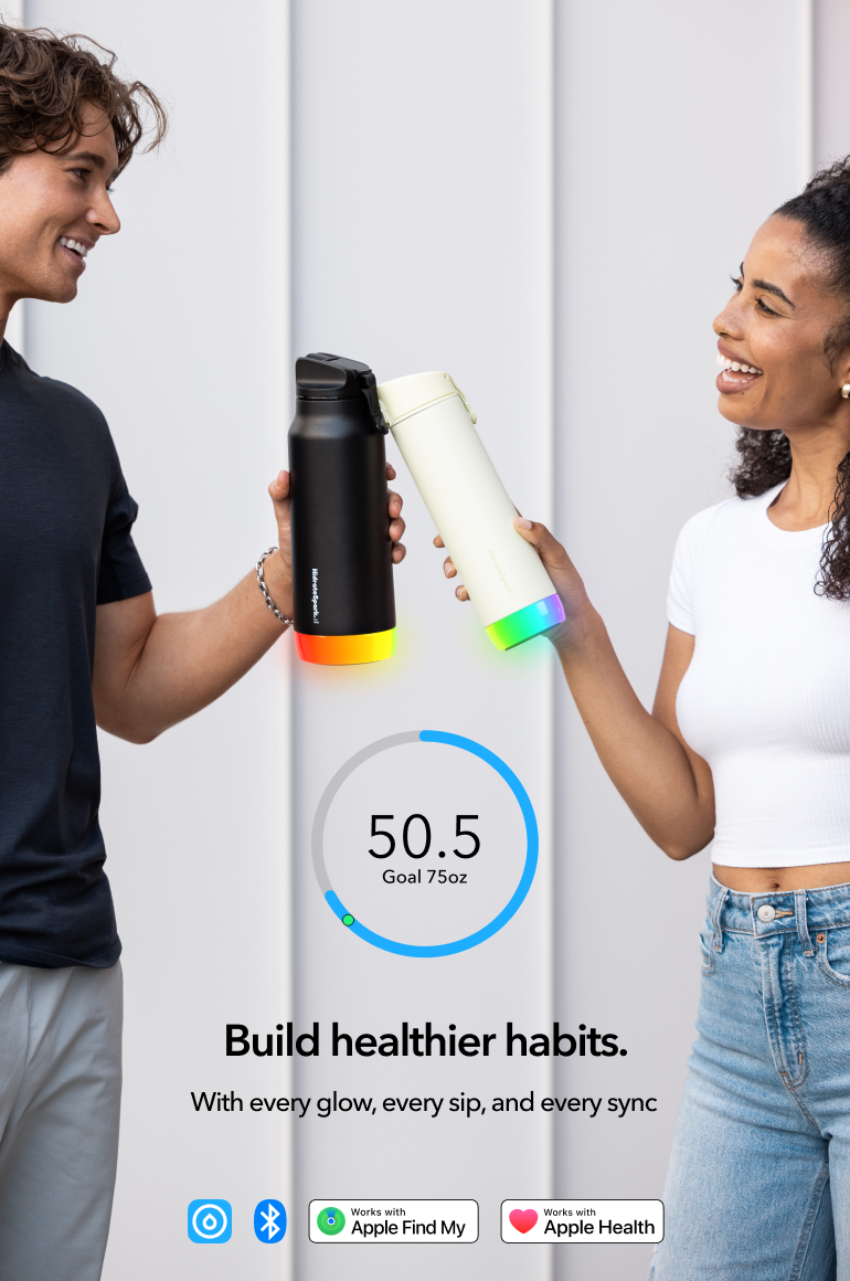
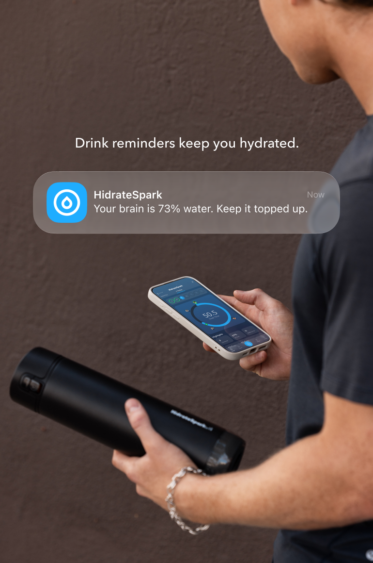
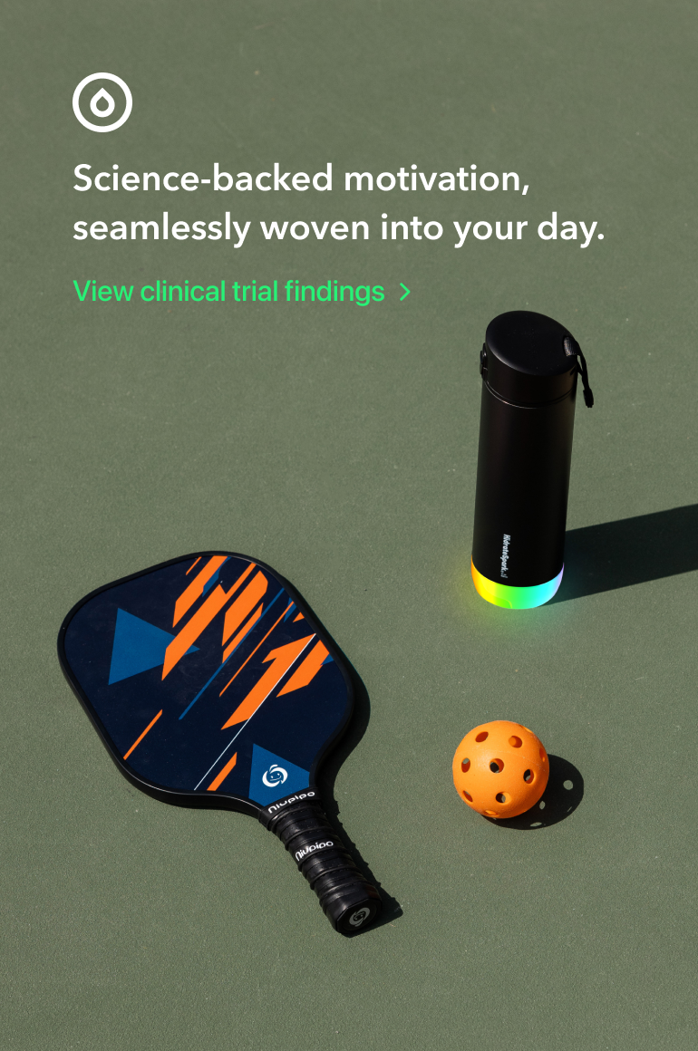
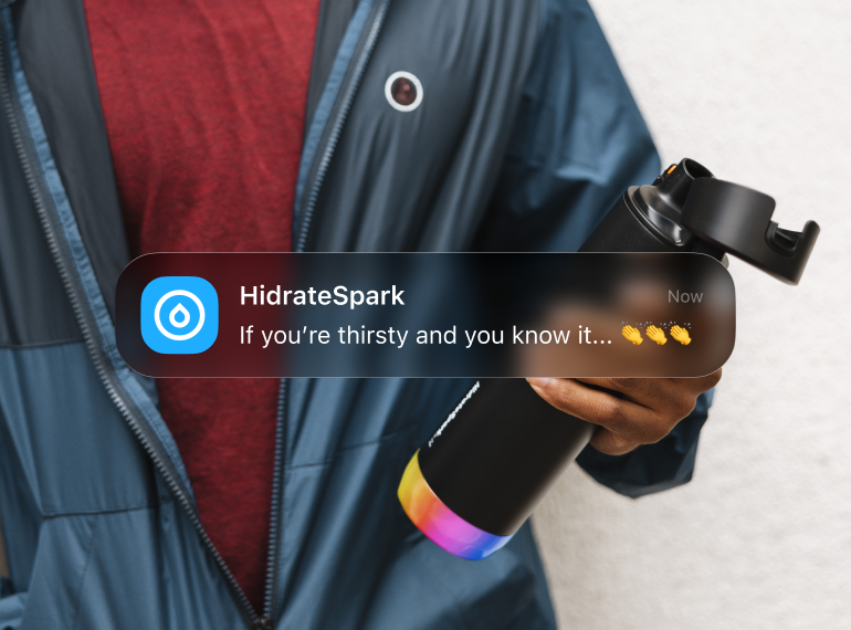
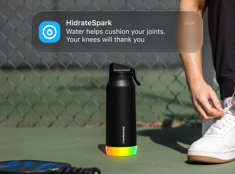
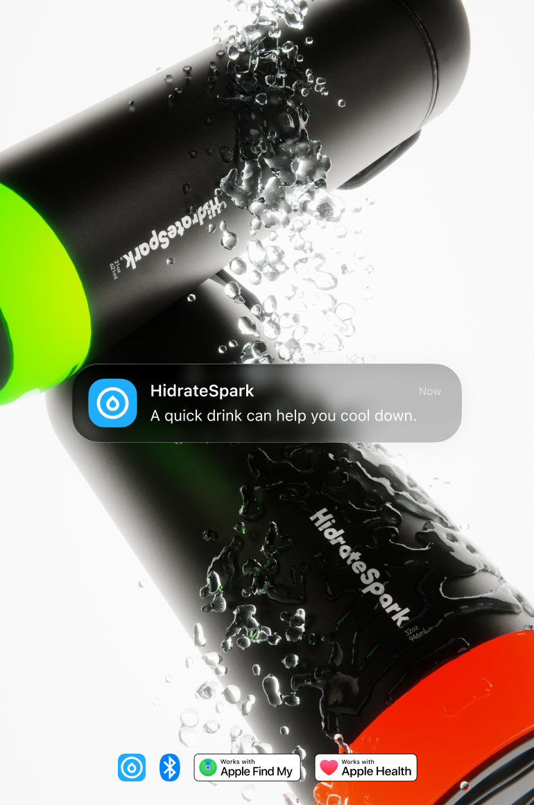
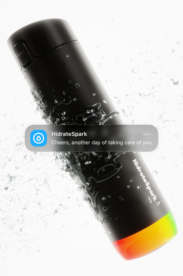
Hydration is a habit people already know they should build, so the creative needed to make HidrateSpark feel like the smart way to finally do it. I built campaign work around confident, short-form headlines, “Drink Different,” “Drink Smarter,” “Glow, Drink, Track”, paired with the bottle’s rainbow glow as a recurring visual signature across social, lifestyle, and retail-partner creative. Every execution, whether a science-backed clinical callout or a pickleball court lifestyle shot, reinforced the same idea: this isn’t just a bottle, it’s a system built to keep you accountable to your own health.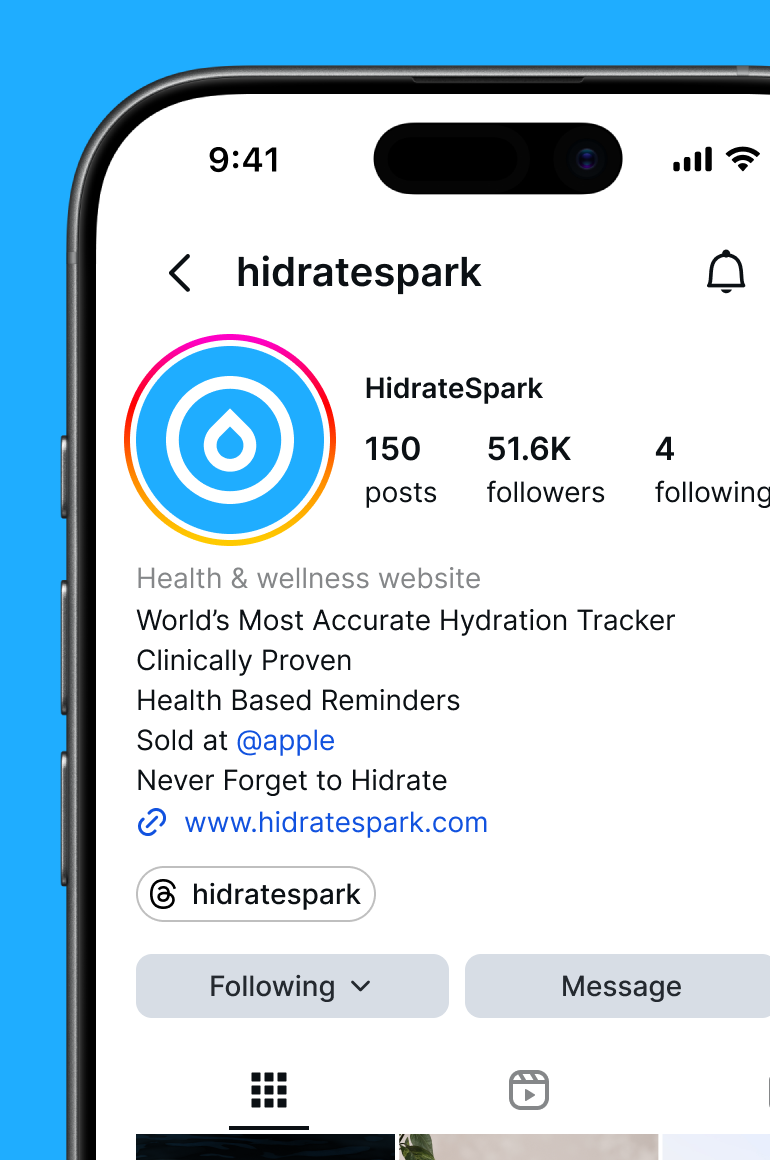
Packaging — Retail
Selling the smart story at shelf, in seconds.
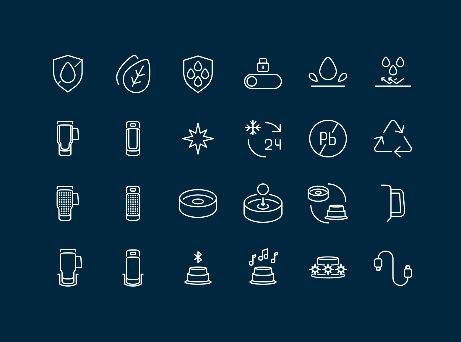
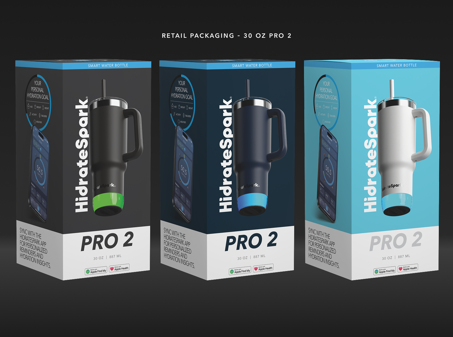
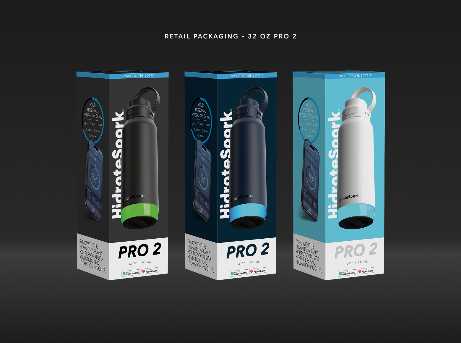
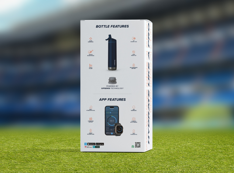
Retail packaging had to do a lot of convincing fast, so I designed Pro 2 boxes across 21, 30, and 32 oz sizes with consistent feature callouts and app screenshots that made the “smart” value proposition obvious before a shopper ever opened the box. Color-matched packaging to each bottle finish kept the system cohesive across the full size and color range, so the shelf presence read as one confident product line rather than a patchwork of SKUs.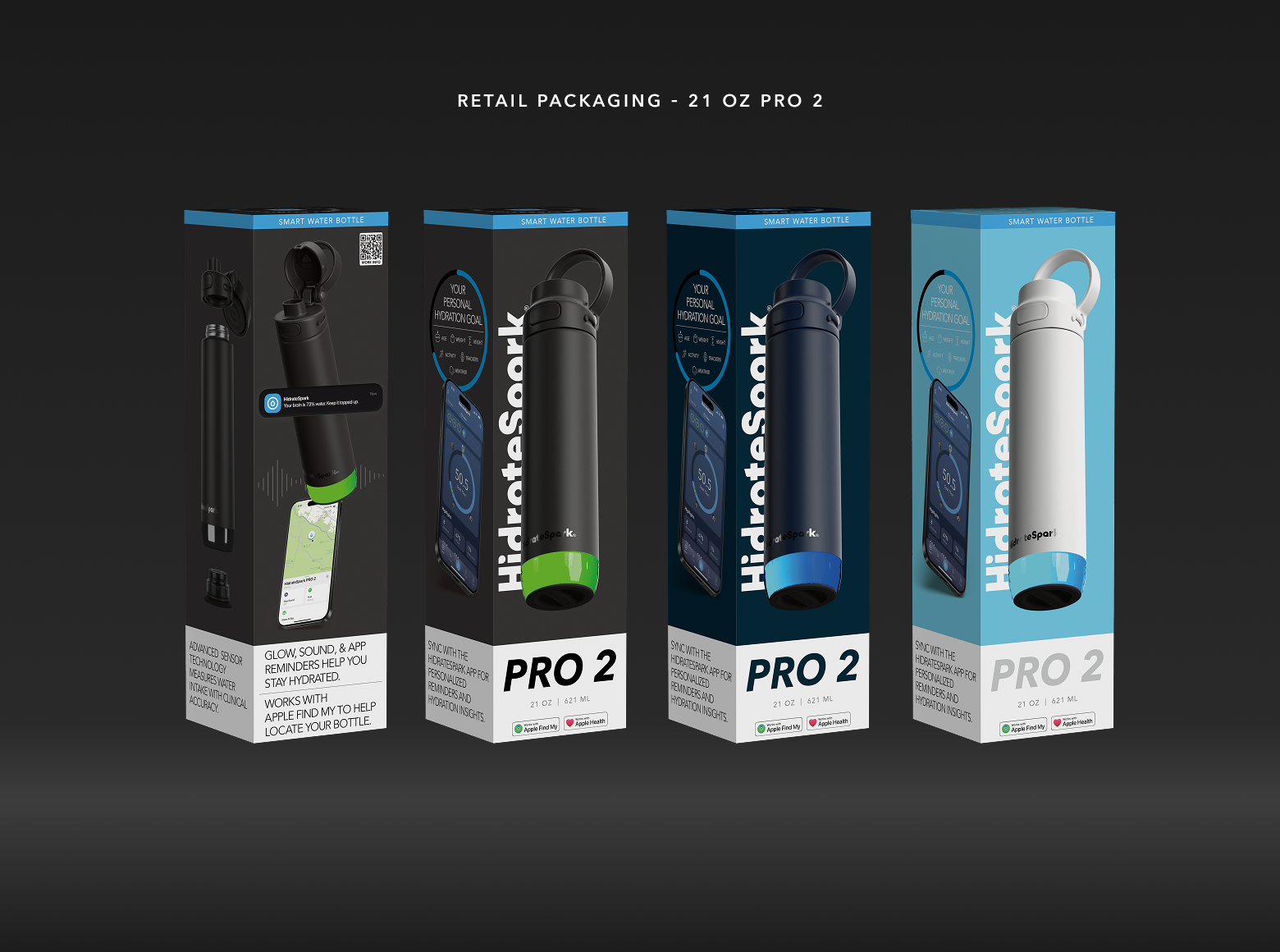
Packaging — DTC
A quieter, more premium unboxing for the brand’s biggest believers.
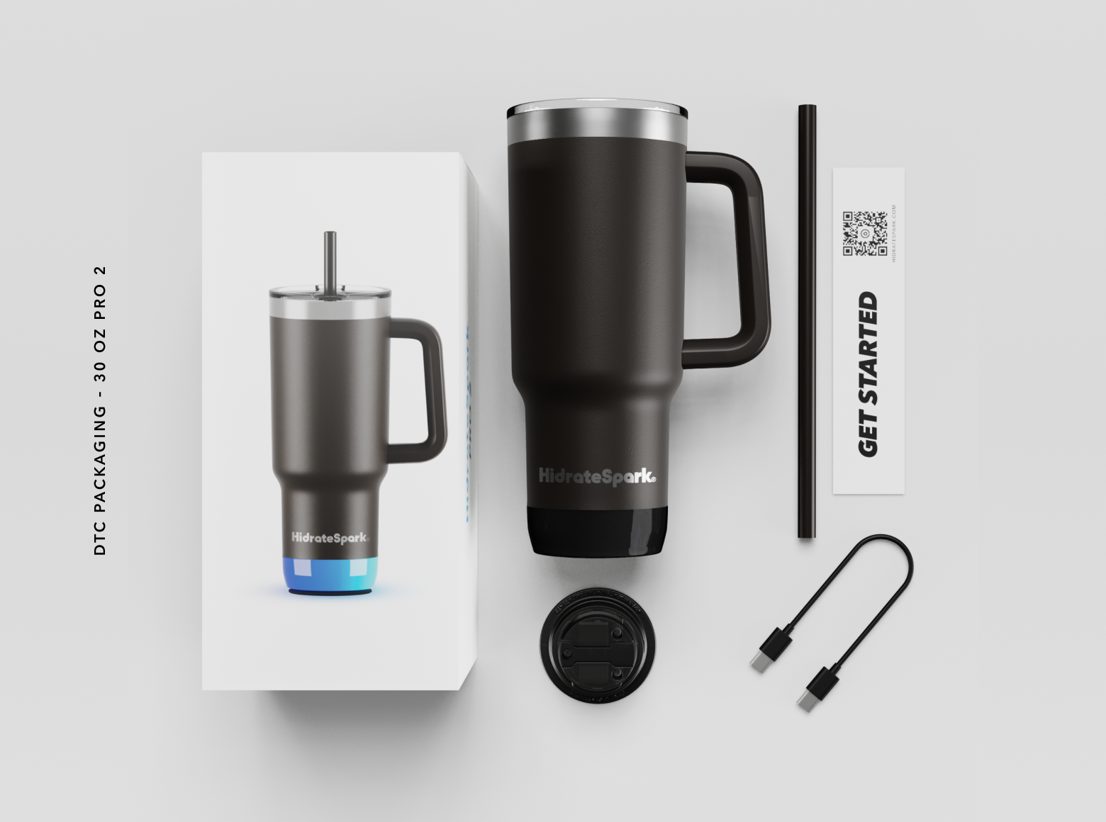
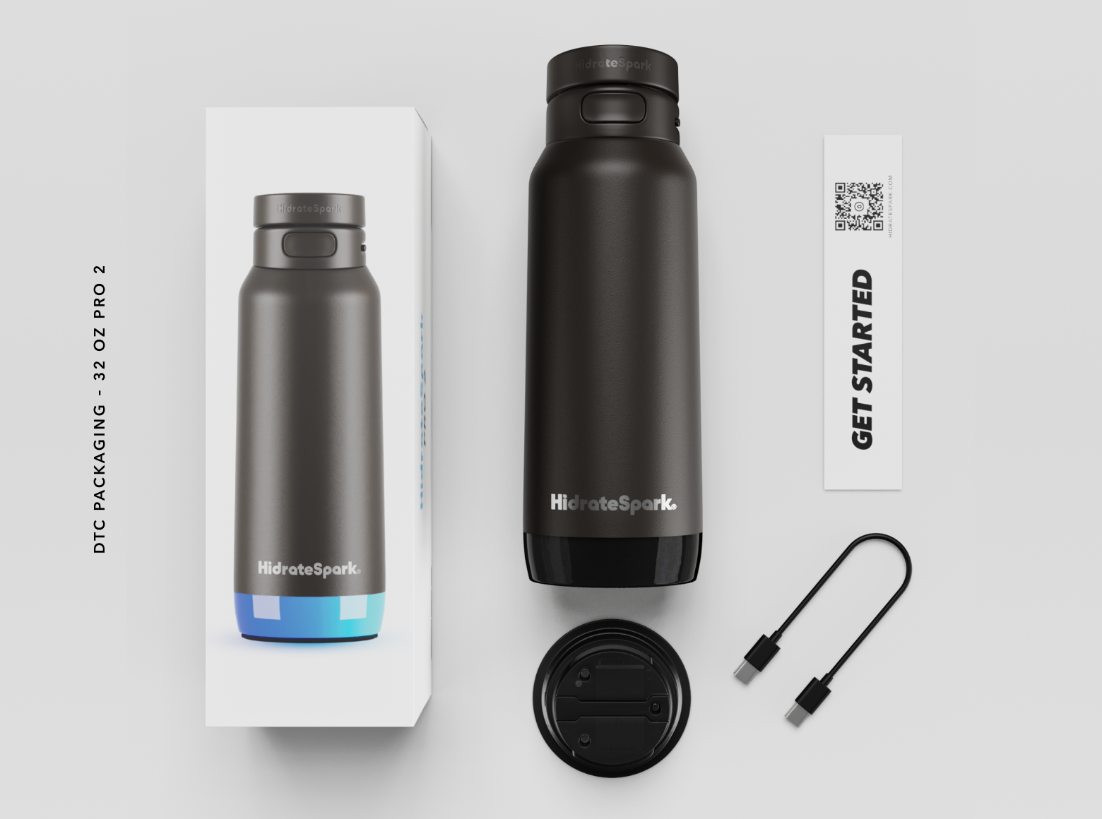
Direct-to-consumer customers already chose HidrateSpark before the box arrived, so this packaging could afford to be quieter and more premium. I stripped the design down to minimal branding, clean hardware photography, and a simple “Get Started” card, letting the product itself, and the charging cable and components inside, communicate the sophistication of the tech without needing to sell it all over again.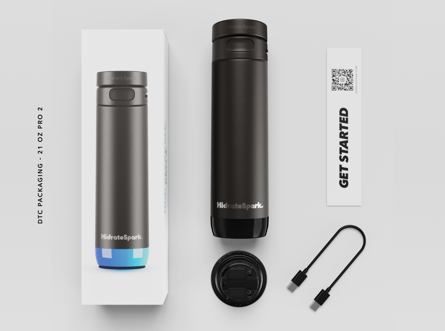
Packaging — Partner
Hydrating like a pro, built for the sidelines.
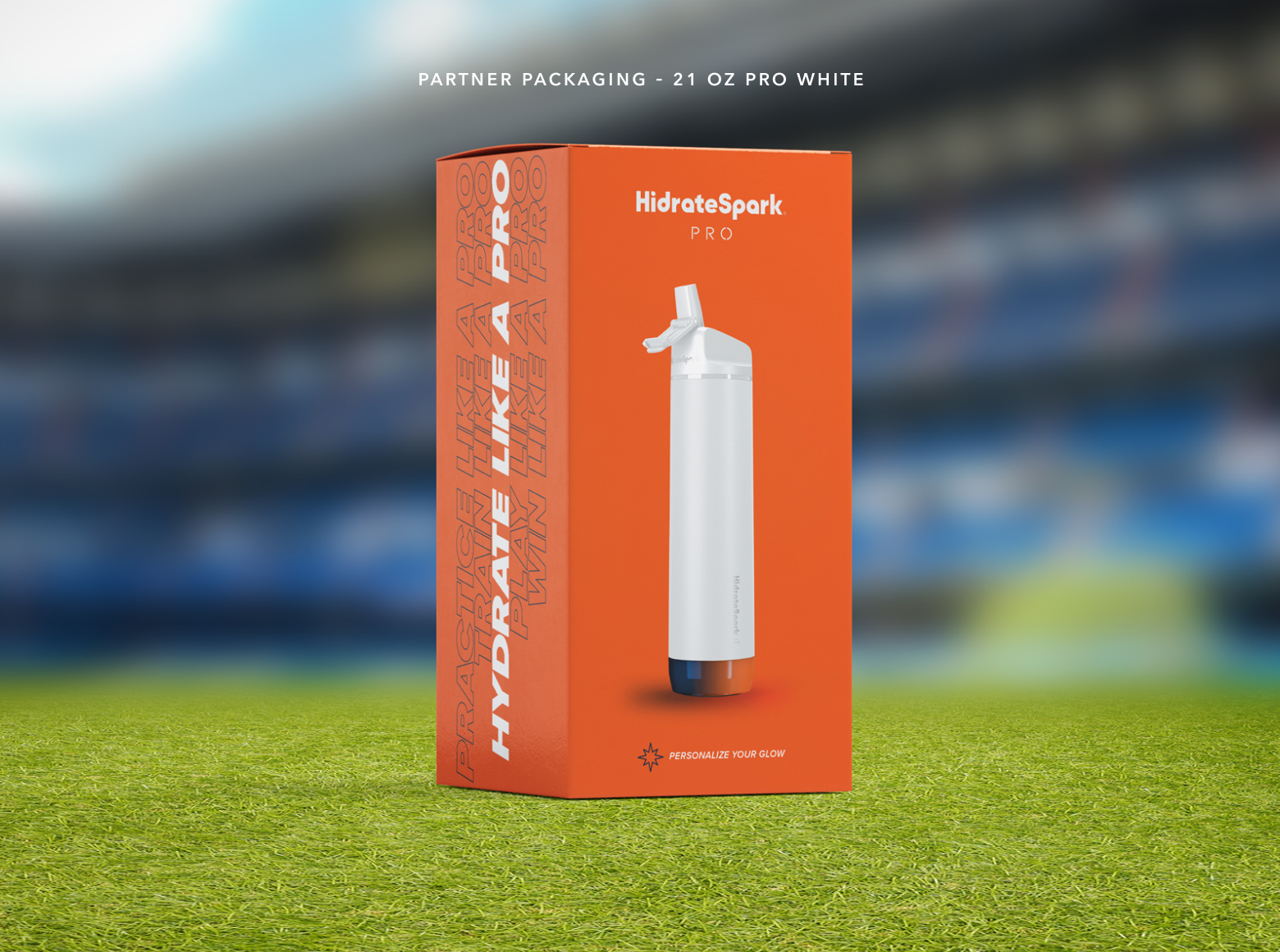
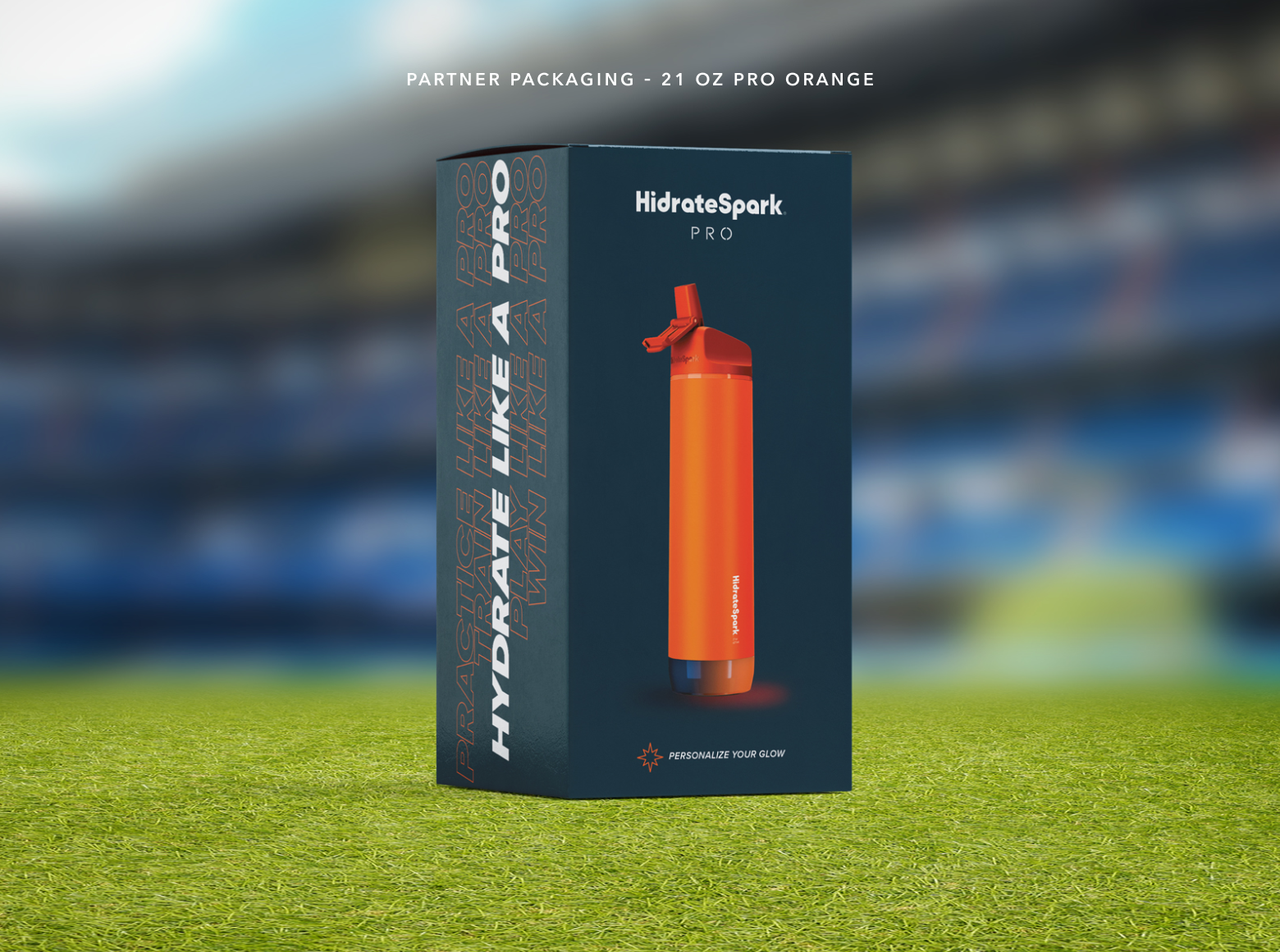
Sports and retail partnerships needed packaging with more energy and a sharper point of view, so I built a bolder system around “Hydrate Like a Pro,” using team-color variants and stadium-context photography to put the product directly into an athlete’s world. This line proved the brand system could flex into a louder, more athletic register without losing the core identity underneath it.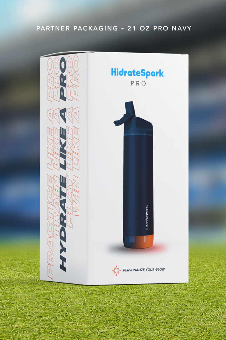
App UI/UX (teaser)
Turning a hydration goal into something worth checking.
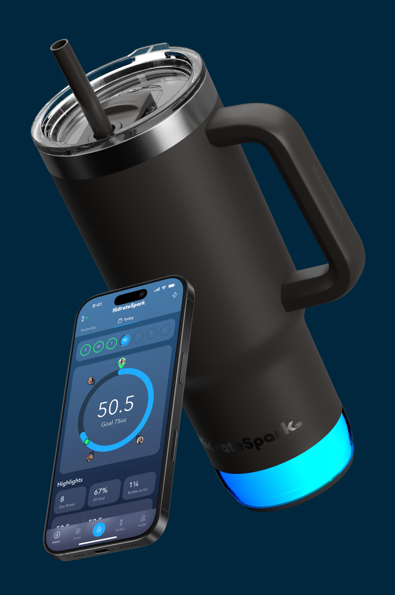
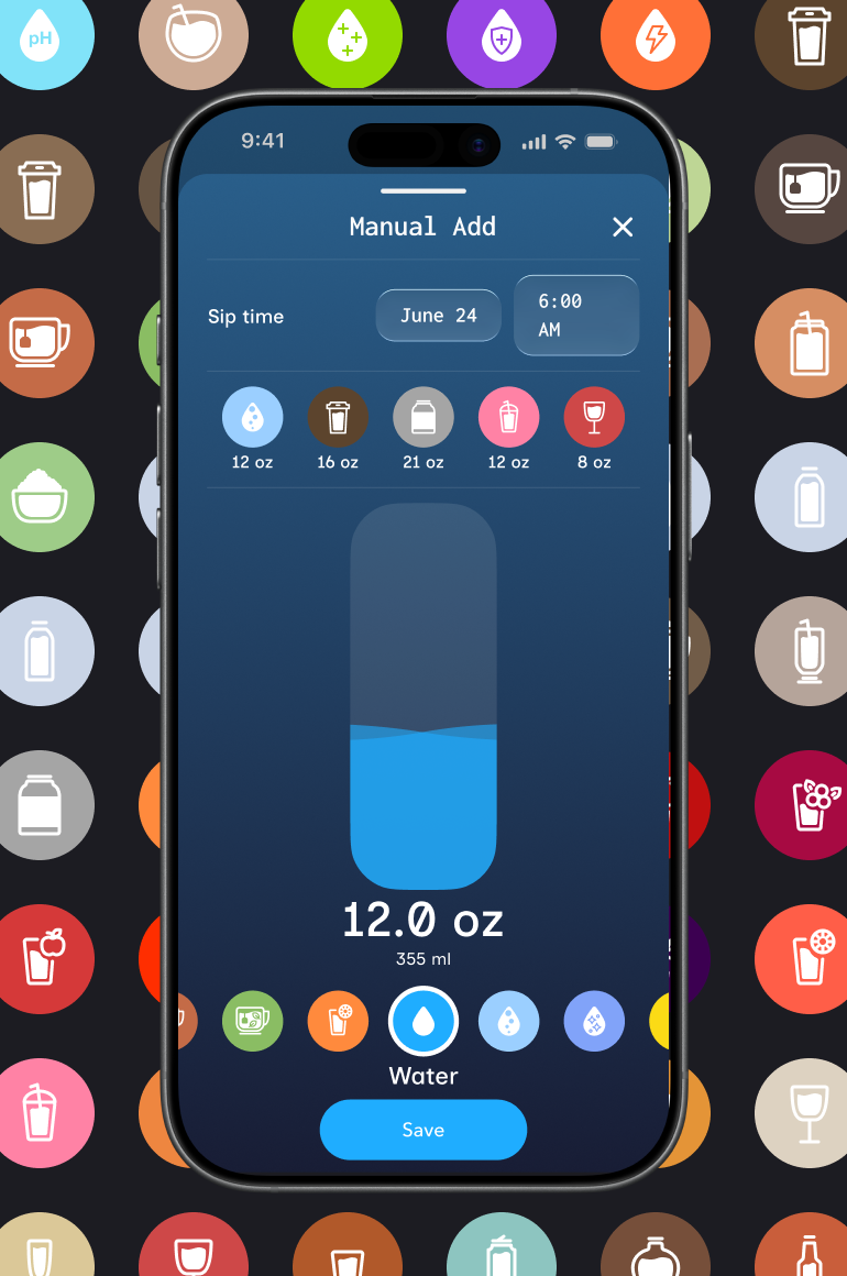
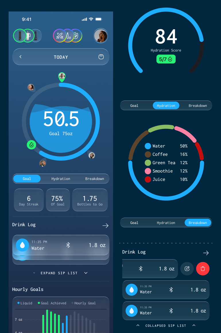
The HidrateSpark app layer, the hydration ring, streaks, highlights, and real-time sync with the bottle itself, represents some of the most interesting design problems in this whole project: making a health metric feel motivating rather than naggy, day after day. There’s a lot more to unpack in that process, so I’m covering it in a dedicated case study → [link soon].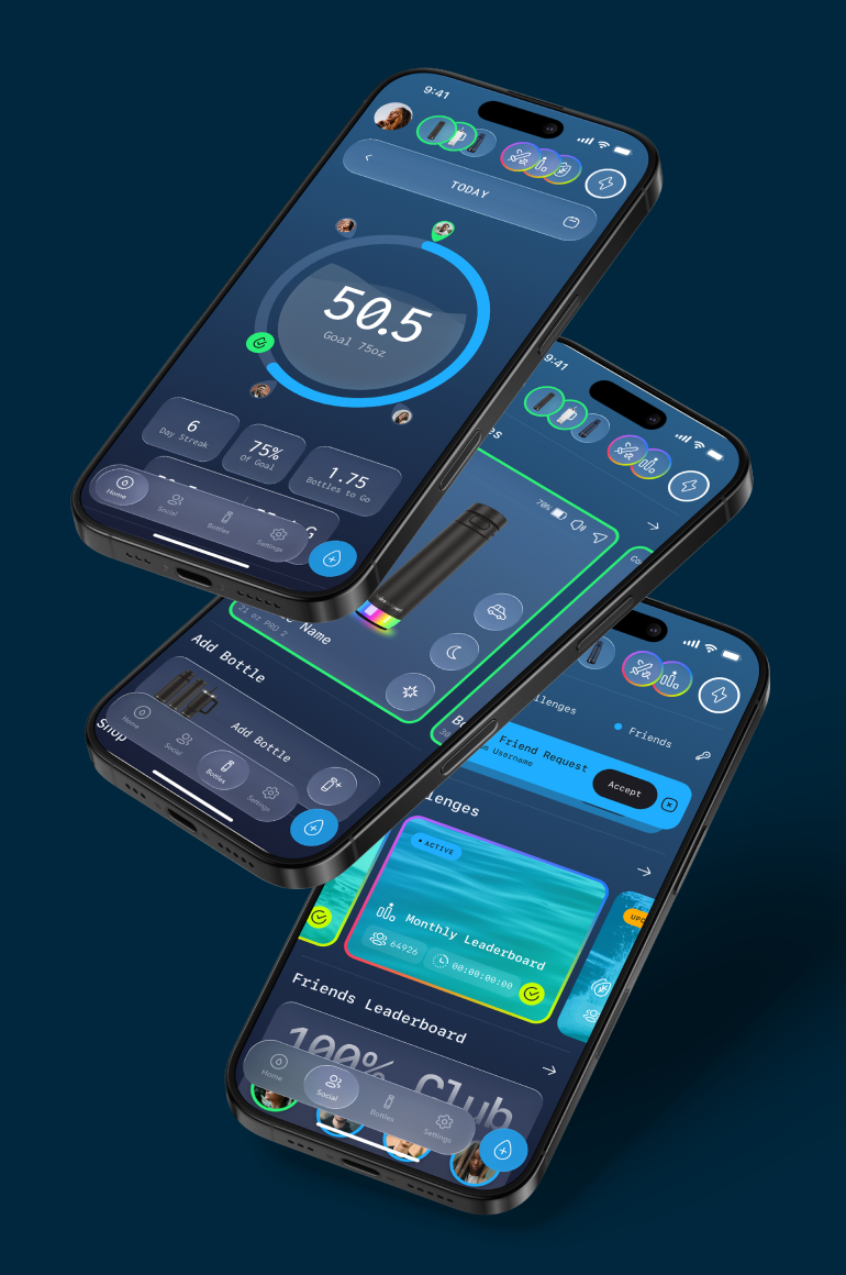
Impact Summary
One brand, fluent in three very different rooms.
By the end, the same visual language was working the shelf at Apple, the quiet confidence of a DTC unboxing, and the energy of a stadium concourse, proof that a strong system doesn’t need to change to stay effective, it just needs to know how to flex.