Irrigreen;
Building a brand system across an entire company
Overview
A brand built for a company solving a real water problem.
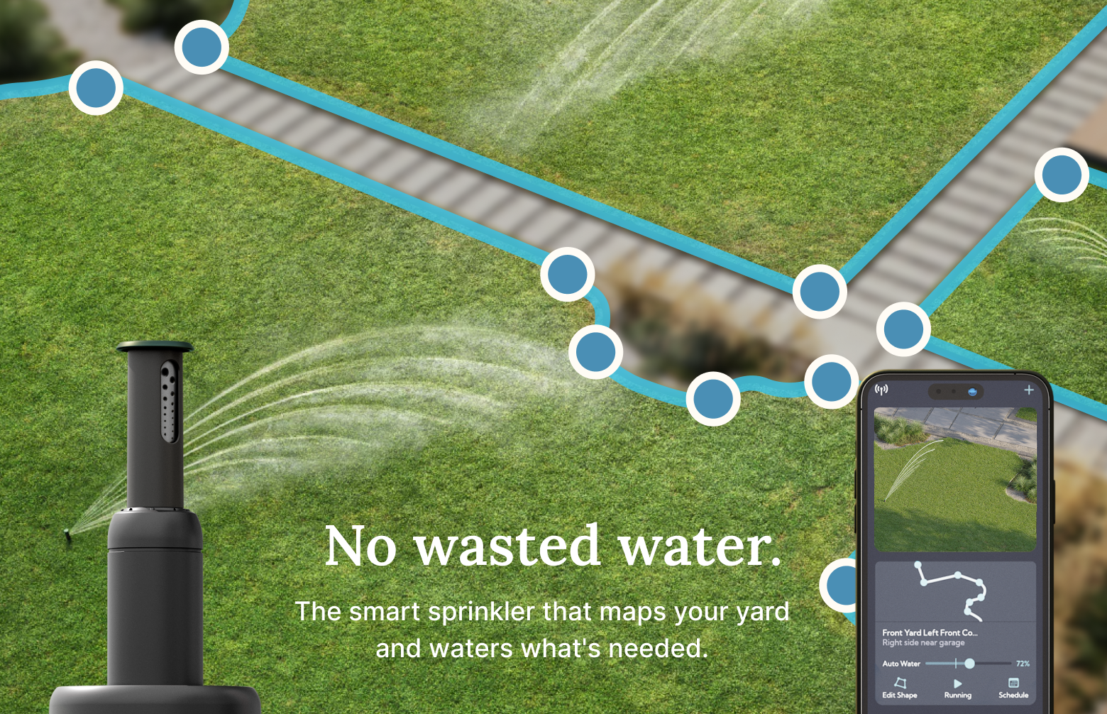
Irrigreen isn't just a smarter sprinkler, it's a genuine answer to residential water waste, mapping a yard down to the blade of grass and watering only what needs it, cutting water use by up to 50%. I was brought on to build a brand system worthy of that mission: precise, intelligent, and human enough to make water conservation feel personal rather than preachy. This case study walks through six touchpoints, brand & identity, digital ads, HubSpot email, C-suite presentations, sales presentations, and field collateral for contractors, each one carrying that same sense of purpose to a different audience.Brand & Identity
Turning a mark into a system everyone in the company could actually use.
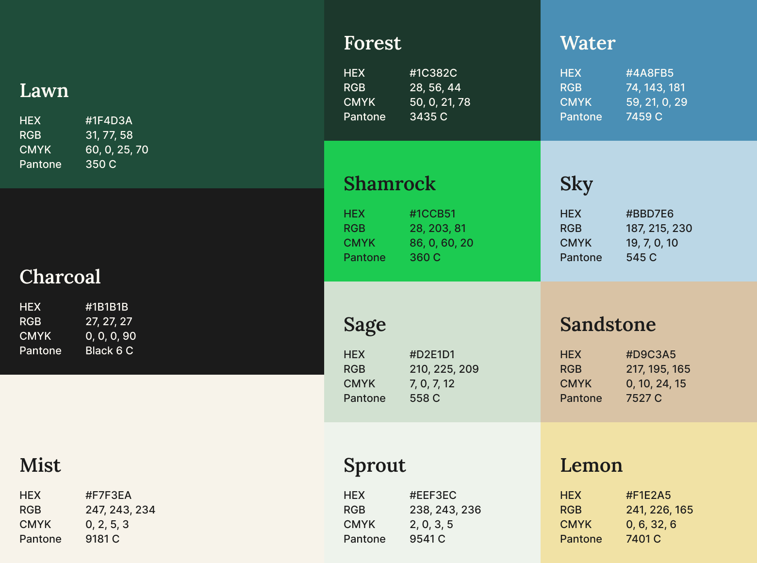
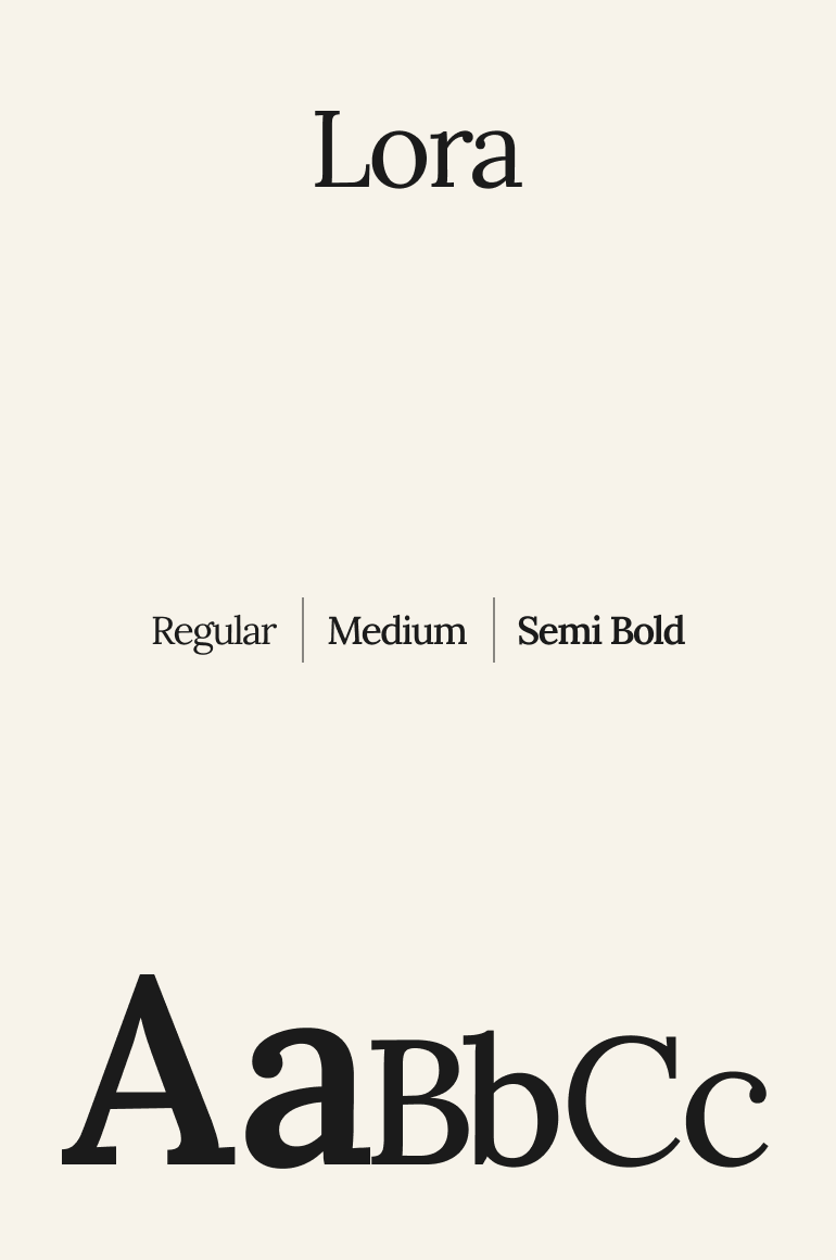
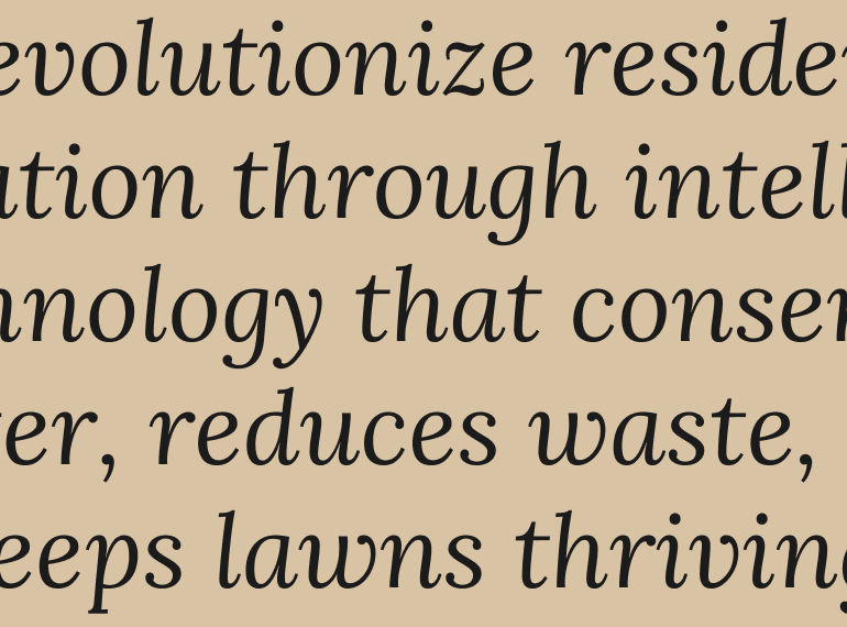
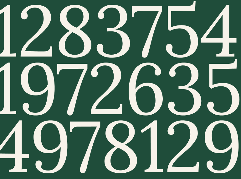
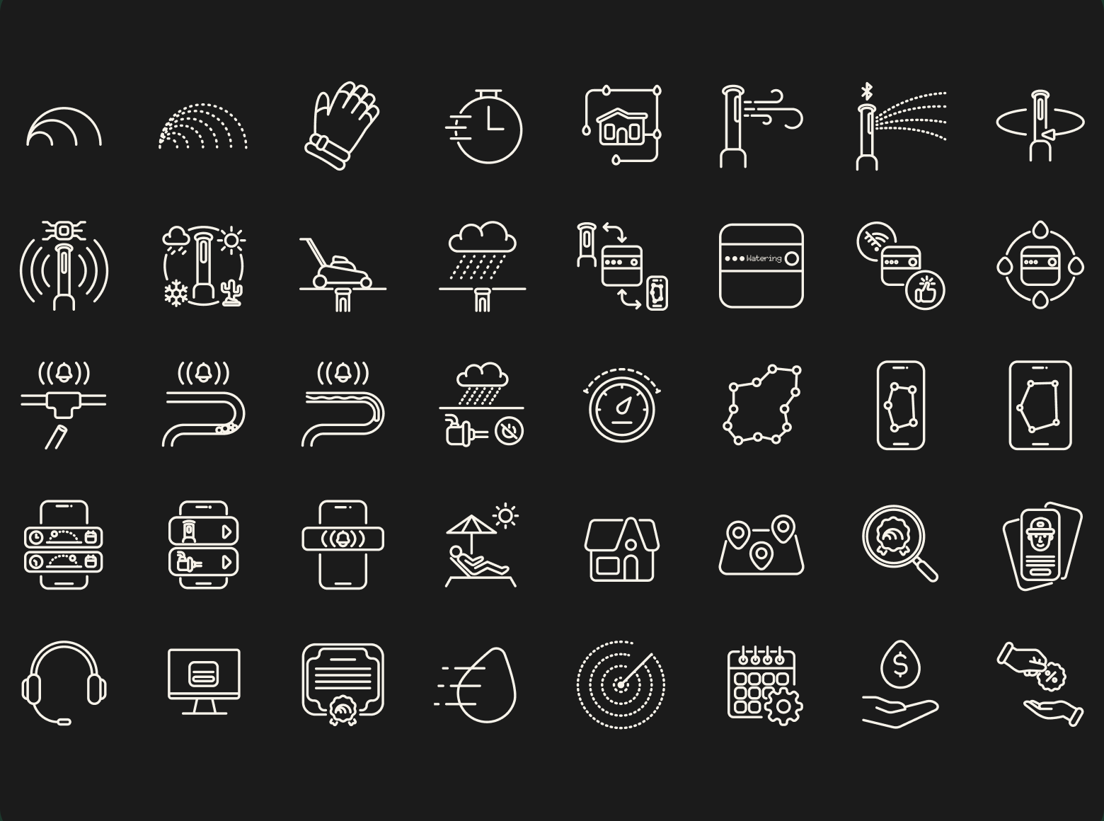
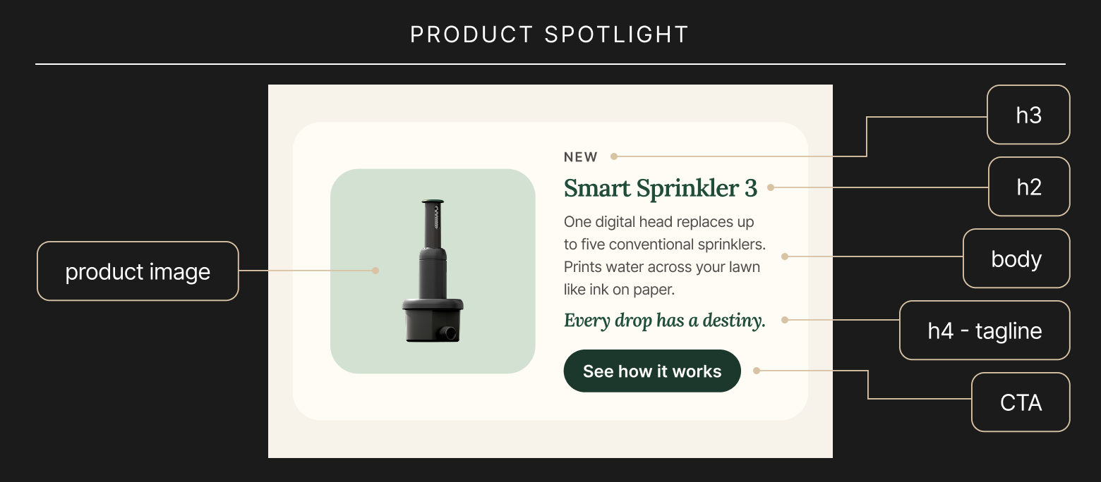
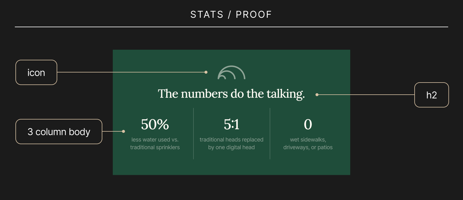
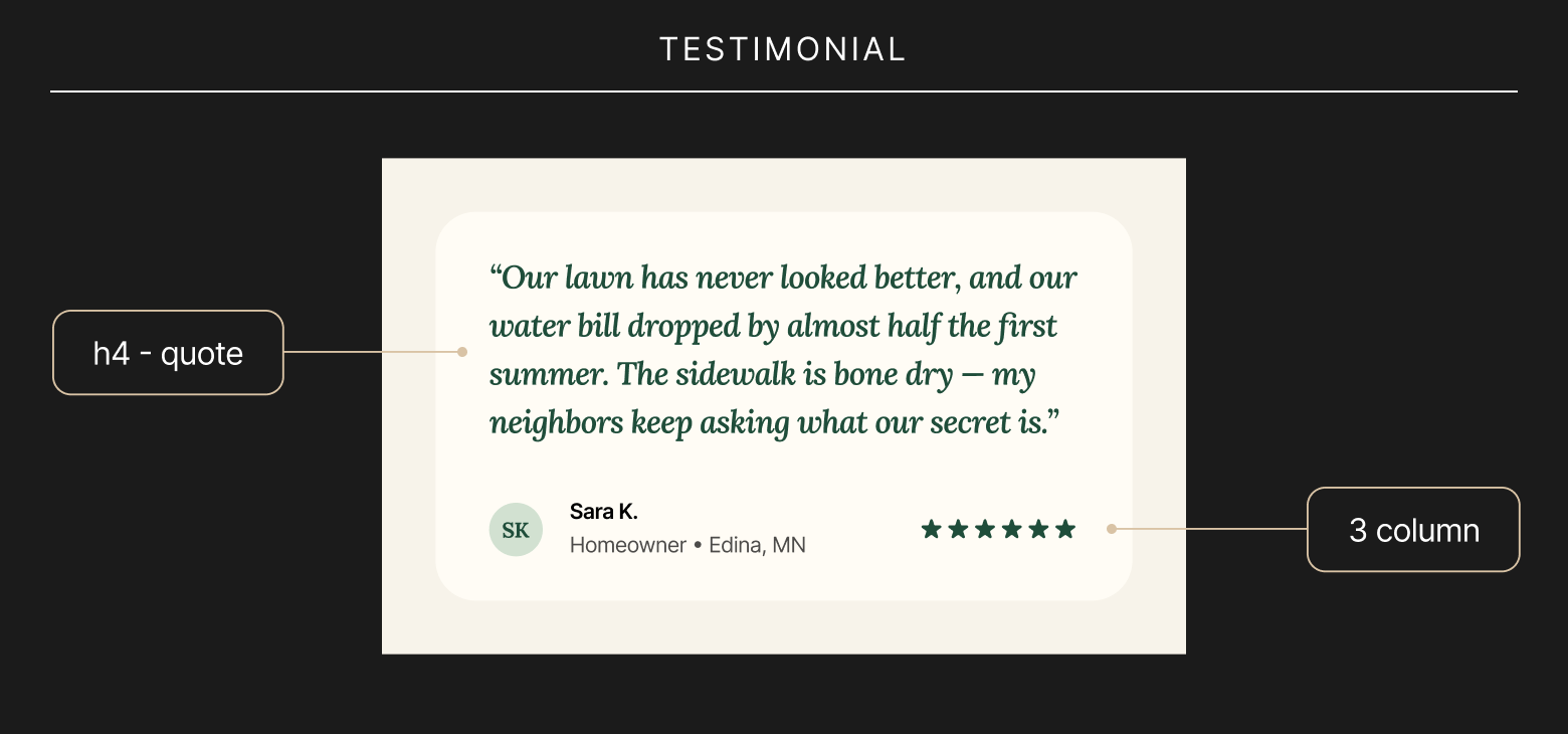
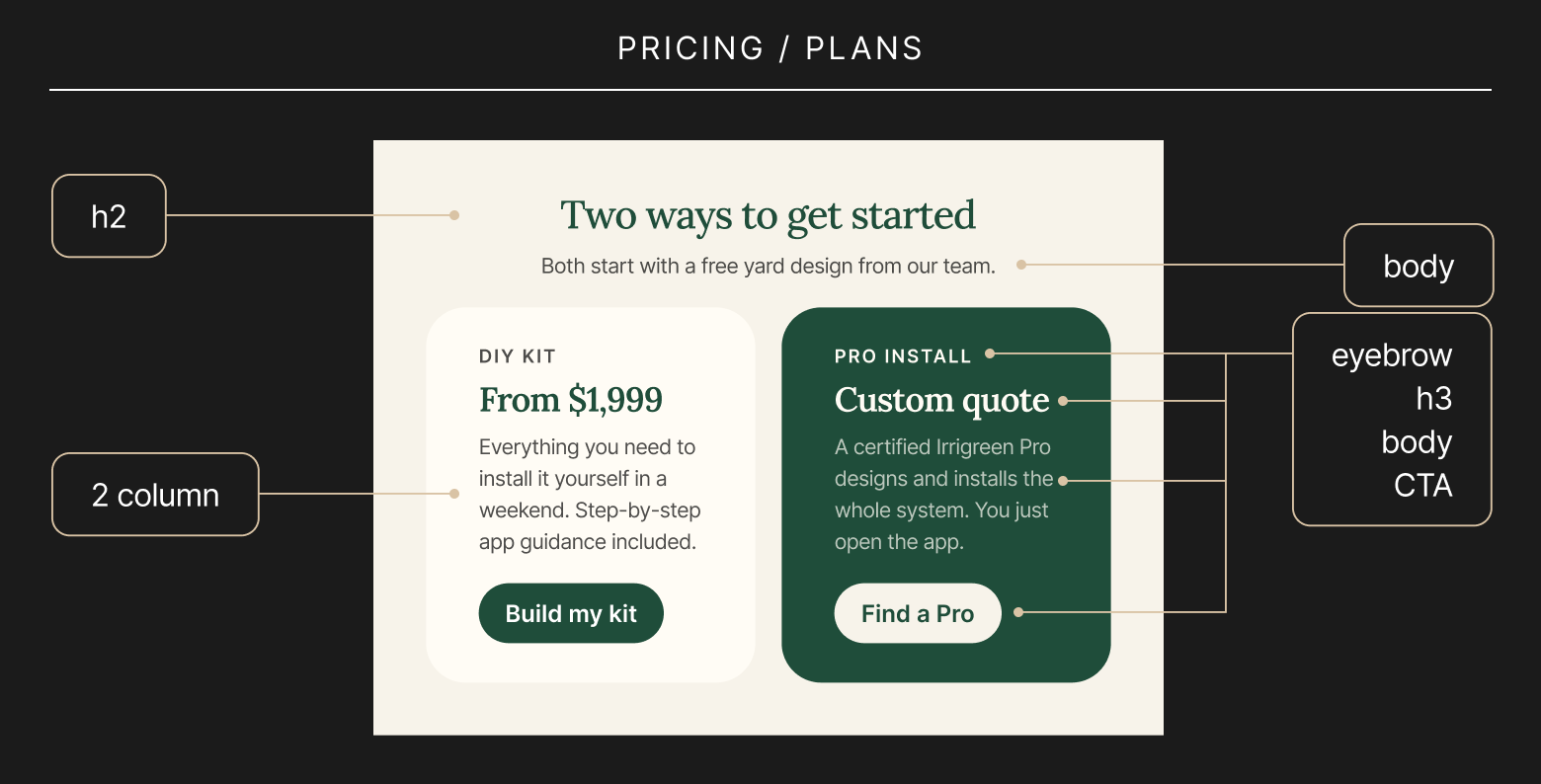
Irrigreen came to the table with a mark already in place, nested arcs that read as their patented sprinkler spray. My job was to build everything around it: a full brand guideline system covering voice & tone, brand language, color, typography, and a scalable icon library, so that mark could show up consistently no matter who at the company was designing with it. I used Claude Design to move quickly through ideation and land on finalized systems fast, which meant less time spent on production and more time spent making sure the guidelines actually held up across marketing, sales, field collateral, and product. The result was a brand language built not just to look right, but to be usable by an entire cross-functional team without a designer in every room.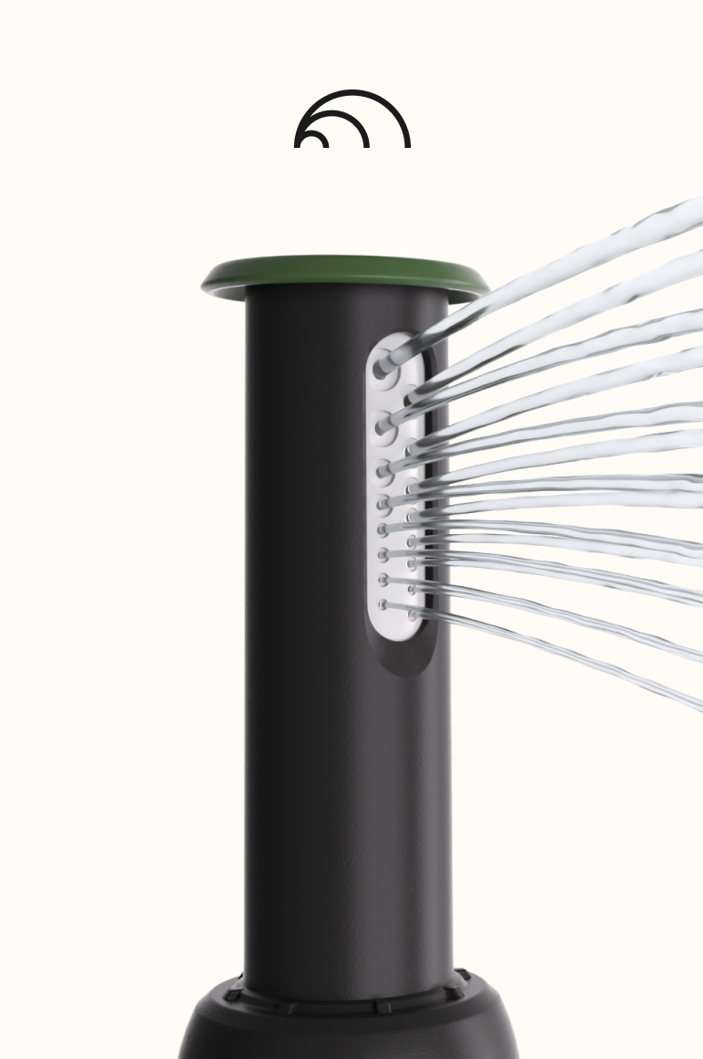
App UI/UX (teaser)
Designing in tandem with engineering, not after them.
The app work happened alongside Irrigreen's dev and engineering teams as they alpha- and beta-tested new hardware in real time, which meant the UX logic needed to move just as fast as the devices themselves. Using Claude Design, I was able to make cross-app UX changes quickly as new device capabilities came online, freeing up more of my time to focus on what mattered most: final UI prototypes and onboarding flows for the new devices, built with real knowledge of what was actually shipping rather than guessing ahead of engineering. There's a lot more to unpack in that process, so I'm covering it in a dedicated case study → [link soon].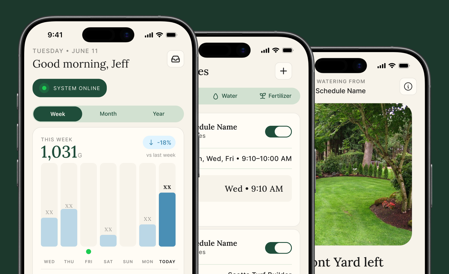
Digital Ads
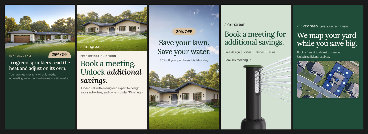
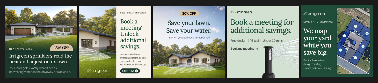
Making conservation feel like an upgrade, not a sacrifice.
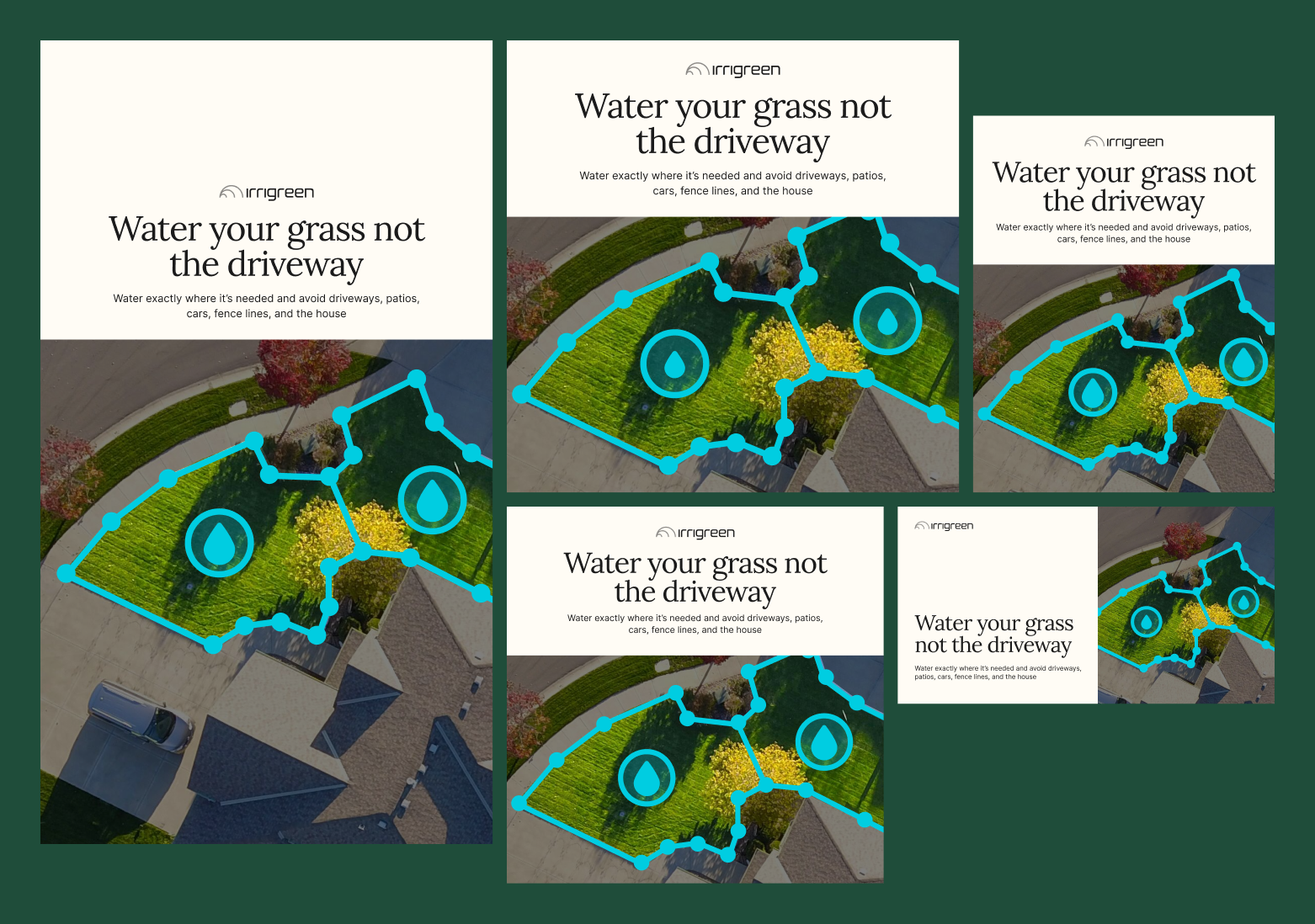
Most sustainable products ask people to give something up. Irrigreen's ads needed to do the opposite, show that saving water actually means a better-looking lawn, less hassle, and smarter control. I built a system that could flex between aspirational messaging ("Save your lawn. Save your water.") and promotional urgency, always grounding the pitch in real, lush lawn photography so the water savings never felt like a trade-off.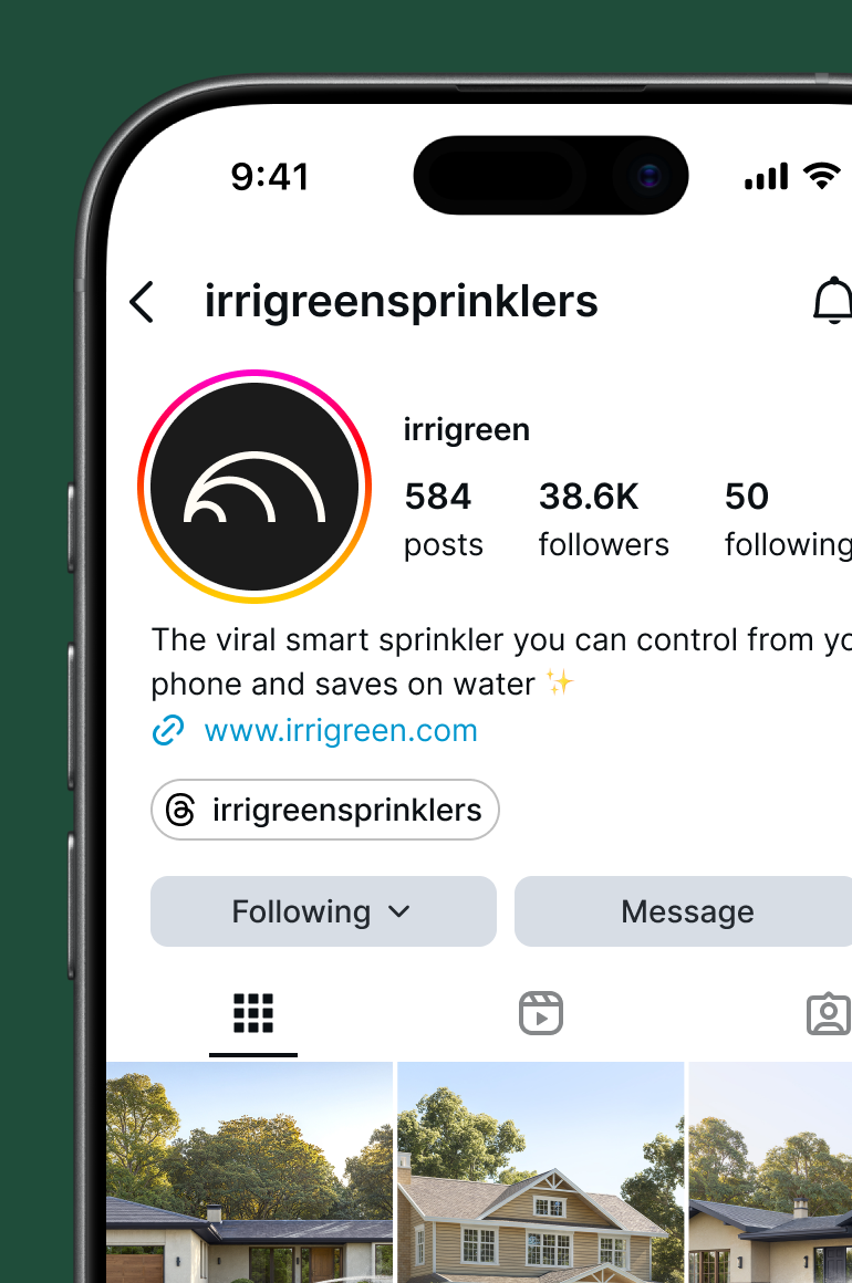
Email (HubSpot) Templates
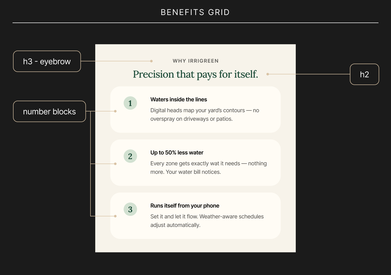
Scaling the mission without scaling the workload.
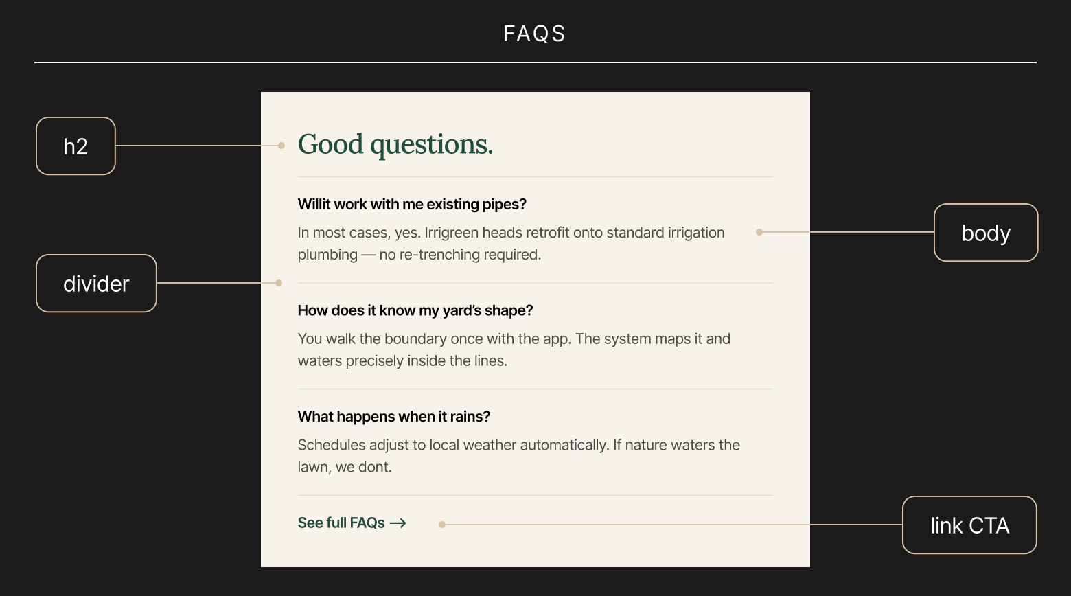
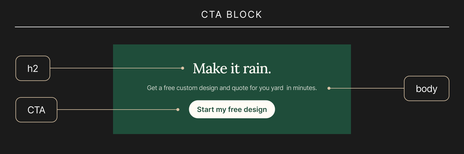
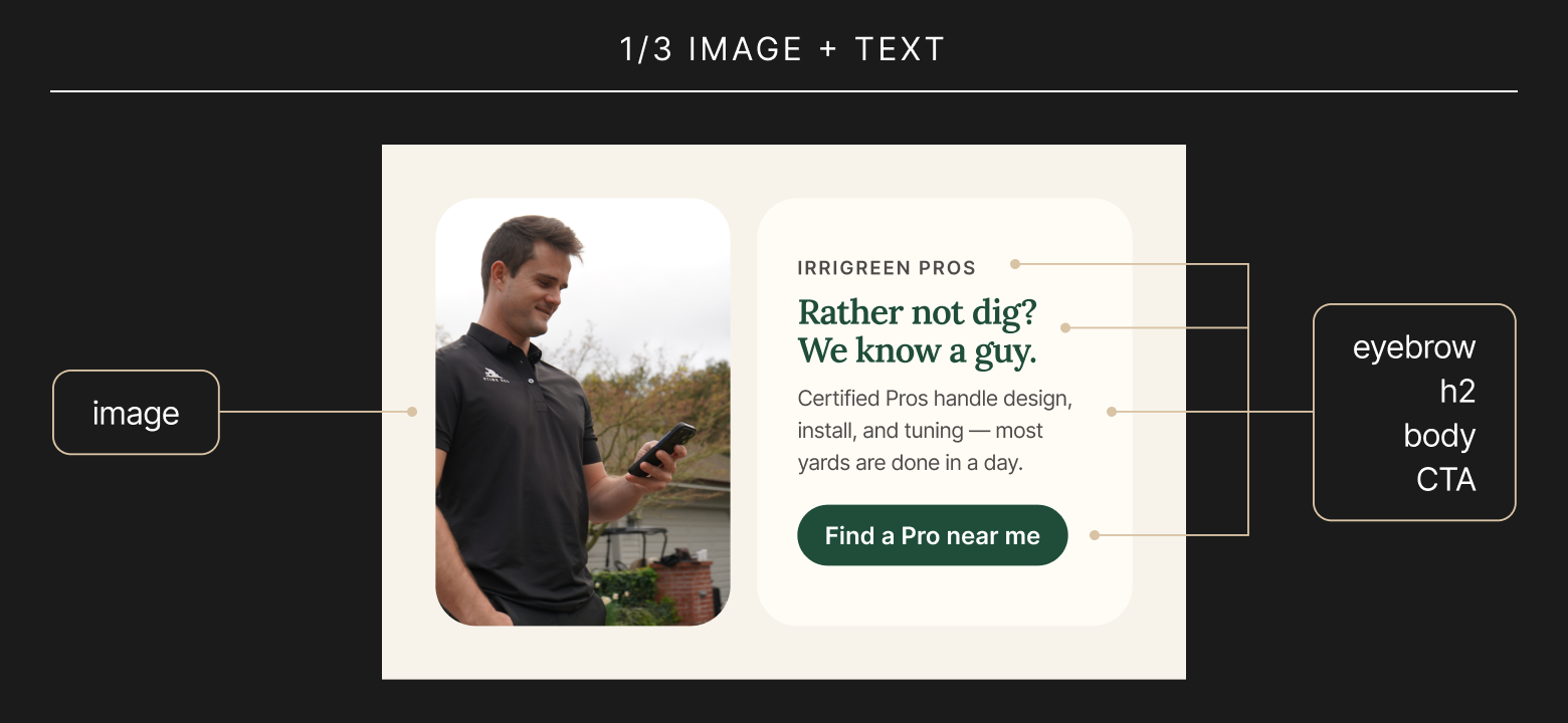
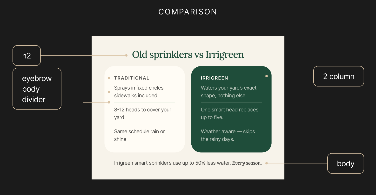
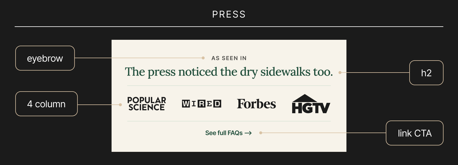
Every email is a chance to reinforce why Irrigreen exists, so I built a modular HubSpot template system the marketing team could run independently: header treatments, hero blocks, and CTA styling that kept the design cohesive across announcements, seasonal promos, and nurture sequences. The goal was a toolkit that let the team move fast without ever diluting the "why" behind the product.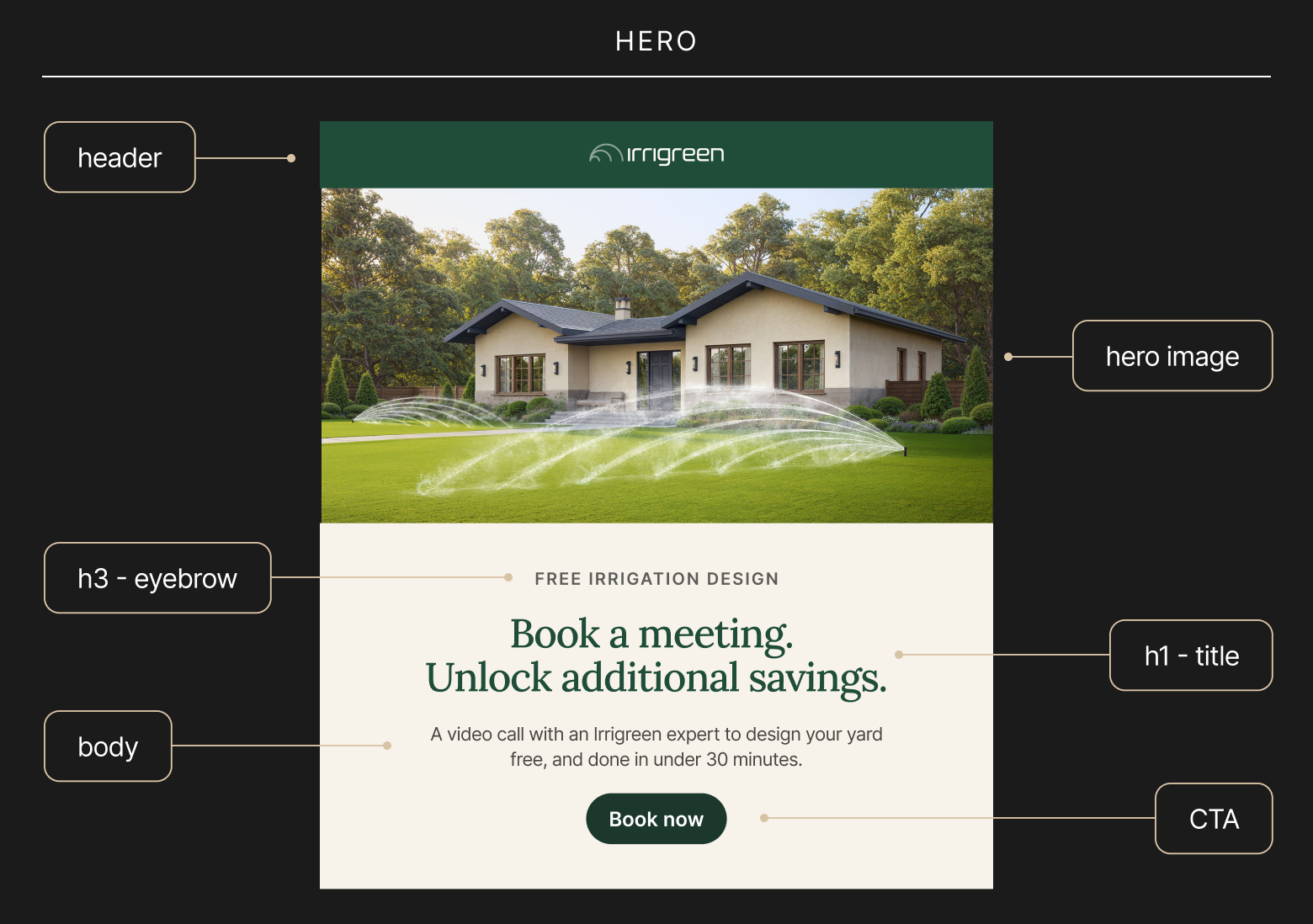
Presentation Design: C-Suite
Making the case for water innovation at the boardroom level.
Investors and board members needed to see Irrigreen as more than a sprinkler company, they needed to see a scalable solution to a growing resource problem. I designed a presentation system built on clean data visualization and confident whitespace, letting the water-savings numbers and market opportunity carry the story with the credibility a Series B conversation demands.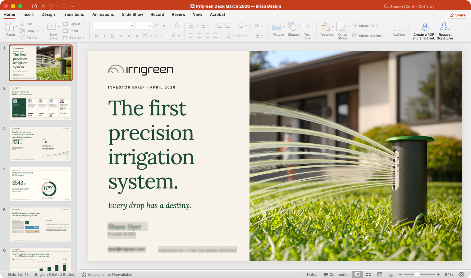
Presentation Design: Sales
Turning conservation into a conversation a homeowner can say yes to.
On a porch, the pitch has to land fast. I built sales decks that leaned into benefit-led headlines and lifestyle imagery, using the brand's icon set to quickly show features like weather-aware scheduling and SmartRinse self-cleaning, each one a small proof point that smart technology and water savings aren't a compromise, they're an upgrade.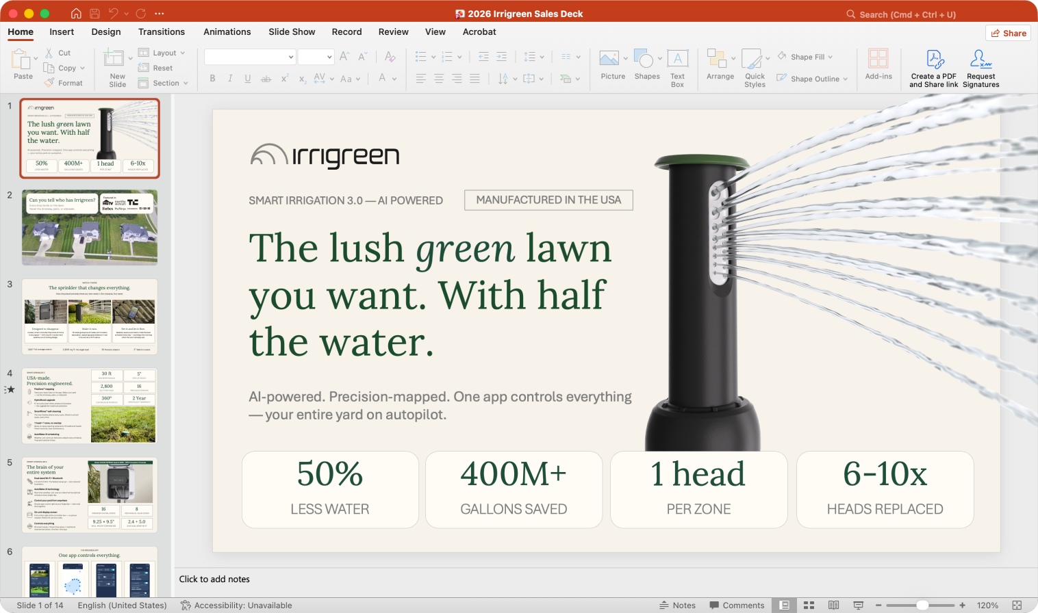
Field Collateral (Yard Signs & Door Hangers)
The mission, distilled to what survives a sidewalk.
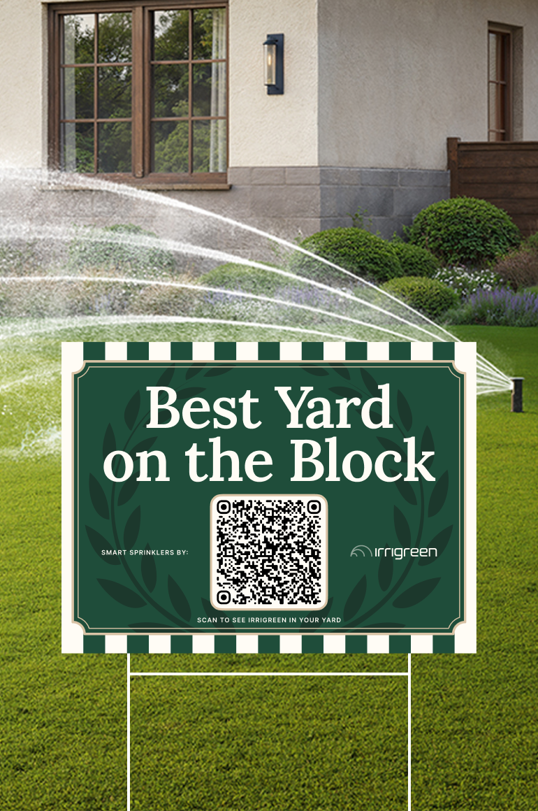
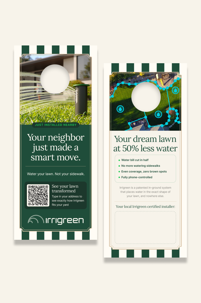
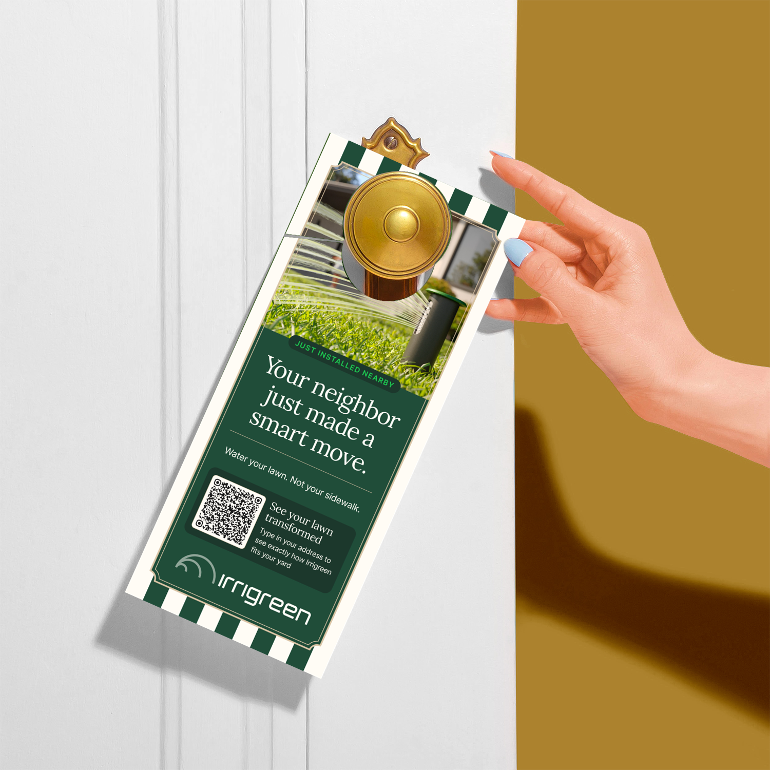
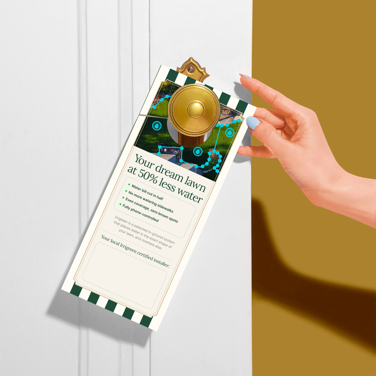
Yard signs and door hangers are where the brand meets a neighborhood directly, often the first and only Irrigreen touchpoint someone sees before Googling the product. I stripped the identity to its most essential elements, mark, headline, minimal color, so the conservation message stayed legible at a glance and held up printed on cardstock and corrugated plastic, no screen required.
Impact Summary
A brand system built around a mission, not just a product.
By the end, a contractor's door hanger, a board deck, and a sales pitch all carried the same underlying belief, that smarter technology and water conservation aren't in tension, they're the same idea. That consistency, department to department, is what turned a brand system into a mission statement people could actually feel.